Some experts say the pitch deck team slide is the most important slide in a startup presentation. Ultimately, If the startup doesn’t have the proper team to grow the business, nothing else matters.
According to studies by Docsend, investors only spend 3 minutes and 44 seconds reviewing a pitch deck, on average. More importantly, they spend 15% of that time reading the Team Slide.
Creating an impactful team slide is an art. Your aim is to describe the key team members, their achievements, and why they are suitable for their roles. Unfortunately, the pitch deck team slide is one of the most challenging slides to get right.
This article will discuss various team slide designs and provide examples from successful startups that have received significant funding.
What is the Pitch Deck Team Slide?
In a pitch deck, a team slide is a visual representation of each member of your startup team. Startups leverage this slide to introduce founders and team members, showcase their backgrounds, and prove that the team has the experiences, skills, and capabilities to drive the startup to success. The slide can include numerous data points about each team member, including headshots, names, job titles, role descriptions, responsibilities, qualifications, and prior career experience.
Generally, there are three options you can choose from when creating content and designing your team slide – the full bio, the combined experience slide, and the minimal approach.
Team Slide Option #1: The Full Bio
The Full Bio approach is a great way to showcase the pitch deck team slide. While there are numerous ways that a startup can utilize the team slide, the full bio is the most comprehensive. Generally, these slides resemble a resume, providing a full scope of the team member’s most notable achievements.
This version of the pitch deck team slide can take many different forms.
Sometimes, founders use entire paragraphs to explain the team member’s background and career highlights. Other times, the team uses a series of bullet points to display each member’s history in a more digestible way. Some teams use a mix of paragraphs and bullet points for the slide. They leverage the length of the paragraphs to give a summary and highlight noteworthy accomplishments in the bullet points.
Pros and Cons
There are pros and cons associated with using this approach. This format uses more text and length than other slide structures, explaining team members’ experiences more broadly.
However, extended team slides are detrimental when presenting your pitch deck. Instead of listening to you, investors will use their attention to read your text. If investors are reading your slides during your presentation, you’ve failed. Instead, they should browse the text quickly while intensely listening to your pitch.
When To Use This Approach
We don’t recommend using full biographies in pitch deck team slides for every occasion. When pitching your business to investors, there are better team slide options. However, if you’re emailing the deck as an introduction to investors, this extended version is ideal.
The key to leveraging this slide is ensuring each member’s bio is concise and well-structured. Avoid overwhelming the audience with details or unnecessary information. Focus on team members’ relevant backgrounds and align their expertise with your business’s specific challenges.
Full Bio – Team Slide Examples
To make a great team slide with the full bio approach, check out examples from other early-stage companies that got funding from investors and venture capitalists.
Fyre’s Team Slide

Those who have seen the Netflix or Hulu specials about Fyre already know how disastrous the venture was.
While the Fyre Festival was a humongous failure, the pitch deck was well-constructed. To the company’s credit, the team raised over $26 million for an island-sized load of confusion, hunger, and media humiliation.
Humor aside, Fyre’s team slide includes significant information about its founders. The slide gives insight into each team member’s background and explains their role responsibilities. It shows how each founder contributes to the business and how their experiences match their team responsibilities.
Mattermark’s Team Slide

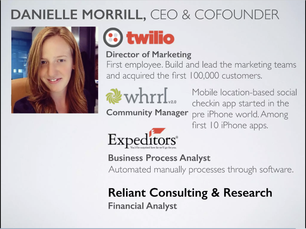
Mattermark may have misunderstood what the term pitch deck team slide meant. Typically, companies present their teams on a single slide. However, Mattermark gave each member an entire slide for their biography.
There are several changes we would make to this slide if we created it. However, there are some elements that do catch our attention.
From a visual perspective, the slide is overwhelming. This part of the presentation doesn’t flow well. When you view the slide, it feels off-putting instead of inviting.
It makes the reader avoid reading it instead of making them want to engage with the information. A better design would make it easier for readers to digest the information.
This slide gives the same feeling as entering an extreme hoarder’s front door. Your eyes can’t make sense of what’s happening, and your brain immediately feels overwhelmed with information. Instead of feeling comfortable and at home, you just want to leave immediately.
Despite the long text and terrible design, the slide has some redeeming factors. The use of logos and imagery add credibility to each founder’s background. Readers can quickly see that the founders have experience at big companies like Microsoft and Twilio. Unfortunately, that may be as far as investors get before giving up on reading through the clutter.
The Airbnb Team Slide
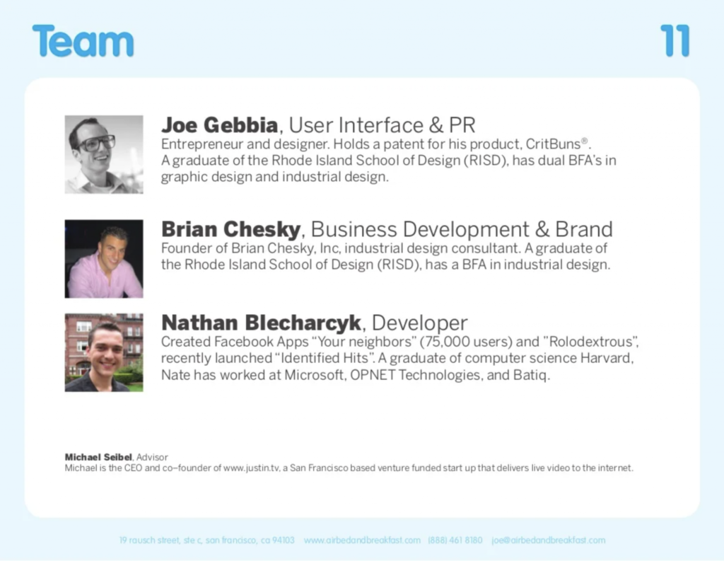
Airbnb’s pitch deck team slide is well laid-out, attractive, and informative. They bolded each founder’s name and presented their positions and responsibilities in large text. The bios are informative and short, using a maximum of three lines. They aligned the photos and text to the left, making the slide look clean and easy to read.
The Takeaway
While we prefer some of the full-bio examples over the others, all of these companies raised capital. When examining these successful pitch deck team slides, there are several lessons we can take away:
- Add the best information, not ALL the information. The team slide is not a place to dump every detail of your professional life. Highlight your relevant experience and the qualities that demonstrate your ability to succeed in your startup role.
- Make it as easy as possible for the reader to digest. The issue with full bio team slides is that they are lengthy. Don’t make it hard for readers to get through your material. Keep the text short. Use bullet points to highlight your career history.
- Use logos and graphics to make the slide more impactful. Founders often lean on text to get the point across in their pitch decks. But in many cases, there are better options available. Graphics, like logos, can tell a story much more effectively than text while streamlining your slide design. Fortunately, if you don’t have a logo yet, you can use a logo maker to get started
Team Slide Option #2: Combined Experience
Another approach to the pitch deck team slide is the Combined Experience bio. In this version, founders showcase their career experience as a team instead of describing each member separately. This shorter version shows the team working together towards one goal. The focus is on what the team can do rather than the backgrounds of each team member.
A brand can present a pitch deck team slide with a Combined Experience structure in numerous ways. Brands can show combined experience with statistics, like their total sales or capital raised. They can also highlight key achievements or important facts about their team.
Pros and Cons
There are many team slide formats you can use, but none of them are without flaws. While the Combined Experience variant is an excellent approach for a great team slide, it can also have drawbacks.
The advantage of this type of slide is brevity. It’s a short and clear format that is simple to present, easy to read, and quickly shows the team’s abilities. It presents the team as a unit, helping investors understand the successes and potential of the members as a team unit.
The downfall of this approach is that some investors don’t want to see the team as a whole. They may be interested in understanding the organization of the team. This includes explanations of different positions and evidence of each person’s skills for their respective roles. Unfortunately, a Combined Experience slide will not provide this level of detail.
When To Use This Approach
Use the Combined Experience approach when presenting your pitch deck to an audience. That way, you can fill in the blanks about each team member during the presentation.
Avoid using this format when creating a pitch deck for reading instead of one for presenting. Since it provides a minimal view of each team member, it will leave readers with more questions than answers. Unanswered questions can lead to doubt, and doubt leads to objection. The last thing you want to hear from your prospective investors is an objection.
Combined Experience – Team Slide Examples
Many startups have used this approach to present the team in the pitch deck. To create a great team slide, study examples from founders who secured funding from investors and venture capitalists.
The Fyre Team Slide
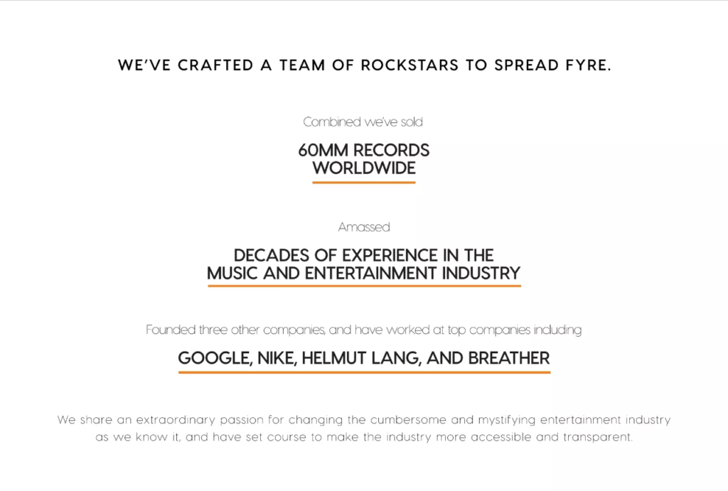
Don’t worry – I’ve already gotten all my Fyre Festival jokes out of the way. While this business is a great model for what not to do, its pitch deck has many great qualities. In the slide, Fyre presents the team’s combined experiences and accomplishments.
According to the slide, the team has worked for big brands such as Google, Nike, Helmut Lang, and Breather. The important information is clear and readable.
The design is clean and consistent with small light text, bolded text, and a thin orange highlight underneath the essential information. The content showcases the team as a unit and clarifies that there is significant experience between the team members.
Intercom’s Pitch Deck Team Slide
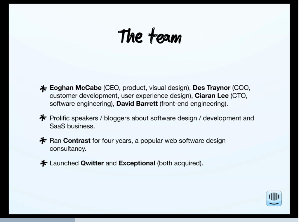
Intercom’s team slide showcases the individual team members and their positions. Yet, it still successfully showcases the team’s highlights as a unit. While we know which individual is responsible for each team role, it is unclear which team member achieved each mentioned accolade.
For example, we know that the team launched Qwitter and Exceptional, and participated in startup acquisitions. However, it isn’t clear whether the entire team participated in establishing those companies or just one of the team members. Most likely, the founders kept things mysterious for a reason.
One massive benefit of this slide type is that it takes the pressure off team members with weaker backgrounds. For example, say one founder launched both mentioned companies, while the other three had no accolades. In this case, the team would seem unbalanced, and investors would question the team’s strength. However, by combining the members’ experience, each member receives equal credit for the achievements.
The Takeaway
The Combined Experience slide can either contribute to the success of your pitch deck or completely backfire. Investors will either love this approach or feel slighted. Only choose this option if your team’s combined statistics are notable enough to make a difference. When examining the previously mentioned samples, there are several lessons we can take away:
- Know when to use a Combined Experience approach. The Combined Experience slide only works in certain circumstances. For example, use it when presenting the slide and when one founder’s accomplishments may have to carry everyone else’s.
- Focus on the highlights that matter most. Refrain from overloading your slide with every possible detail. Be intentional with every highlight and only display the experiences that best align with the startup’s needs.
- Consider adding names and team roles. Use this version when showcasing the highlights of the team as a unit. However, you should still consider adding each member’s name, image, and team role.
Team Slide Option #3: The Minimal Slide
Some brands give detailed background information about each member, while others use a simpler approach in their pitch decks.
This approach is precisely what it sounds like – minimal. Usually, it only includes the member’s headshot, name, and job role. Sometimes, it may consist of a small blurb about their career accomplishments.
This version is relatively obscure and leaves many questions unanswered. On the other hand, it is also clean, streamlined, and straightforward.
Pros and Cons
The Minimal pitch deck team slide is the opposite of the Full Bio version, with reversed strengths and weaknesses.
Unlike the Full Bio team slide, a Minimal approach has a much cleaner design. Pitch deck writers and designers don’t have many elements to work with. Therefore, keeping the slide aligned with the design theme is easier.
Full Bio slides have lots of text and elements, so designers have to squeeze them in to fit. Those slides can become cluttered and overwhelming.
While a minimal design is an advantage, it has its drawbacks, too. It doesn’t provide investors with enough information for them to assess and understand the team’s capabilities.
When To Use This Approach
There is only one time to use this approach – when someone is presenting it. With pitch decks meant to provide information to readers, a full bio or combined experience approach is a more suitable option.
When presenting the deck, the presenter can fill in the gaps that the slide may have missed. You can verbally explain each team member’s background while displaying a clean, easy-to-read slide.
But if you send the pitch deck to an investor for self-review, it will leave more questions than answers. Unanswered questions lead to doubts, and the doubts turn into objections.
The Minimal Approach – Pitch Deck Team Slide Examples
For presentations, the minimal approach is the most popular. When presenting a deck, we recommend this version over others. See the examples below to learn about creating a practical but minimal pitch deck team slide.
SEMRush’s Team Slide

SEMRush’s team slide includes components of the minimal and full bio approaches. It’s short and clean but also provides information about each member’s role and background.
Each team member’s bio follows a consistent format. The first line displays their names. The second line indicates their role. The third line highlights their experience.
The slide is minimal but still effective.
The Buzzfeed Team Slide

BuzzFeed’s team slide uses minimal text to make big statements. This example shows the team role in bold, with the names of the individuals filling the role listed below. Some of the listed team members have parentheses next to their names, mentioning companies they previously worked for.
Buzzfeed uses a unique but impactful design theme for its pitch deck team slide. Since creating this slide, the BuzzFeed team has raised more than $696.3 million in investor and VC funding.
Ooomf’s Pitch Deck Team Slide

Ooomf did an exceptional job presenting its pitch deck team slide. This slide combines the minimal approach with the full bio and combined experience versions. At the top of the slide, the team lists a combined experience statistic. Instead of only showing each member’s name and position, Ooomf listed several summarized highlights to display their credibility.
In this version, the team kept the slide simple and easy on the eyes while presenting a significant amount of information. Ooomf found a way to use very little text but still offered more information than some of the Full Bio examples.
The Takeaway
Experts always suggest minimizing the amount of text on a pitch deck slide. However, it is possible to over-minimize the team slide in your pitch deck. The best slides were minimal but still presented the type of information an investor would want to know. There are a few lessons we can take away from these slides:
- Minimize, but don’t overdo it. The problem with minimal slides is that they can become too bare. You want to reduce the load on your pitch deck team slide. However, don’t minimize it to the point that it no longer includes the information investors want to know.
- Minimize text, not impact. Ultimately, you should reduce the number of words on the page, but not at the expense of quality. To capture investors’ attention, you want to build memorable slides. If you eliminate the fluff, the highlights will stand out.
Pitch Deck Team Slide – A Final Word
Creating the best pitch deck may seem easy, but I assure you it is not. Success means thinking like an investor, examining each slide, and presenting only the important information without any unnecessary details.
The best way to learn how to create a compelling pitch deck team slide is to assess decks from successful companies. Find patterns in their slides, and replicate them to create your team slide.
At ThinkLions, our writers help startups raise money by creating investor packages, business plans, and pitch decks. Contact us, share your goals, and let us help you turn your startup idea into a successful business.


